WellNow Urgent Care
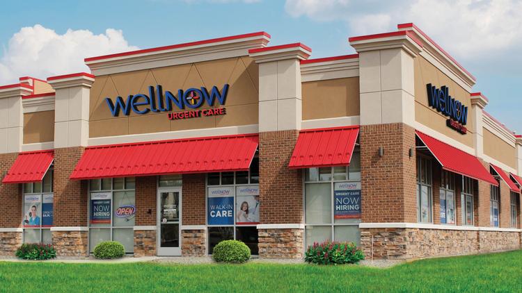
19 Ideas has been a proud partner of WellNow Urgent Care, formerly Five Star Urgent Care, since 2011, prior to the opening of their first location in January 2012. They are now considered to be one of the fastest-growing urgent care networks, a feat that comes along with new creative opportunities – at the end of 2018, that opportunity was presented to us in the form of a complete rebrand.
Beyond just a name change, the transition from Five Star Urgent Care to WellNow Urgent Care required the deep development of strategies in all facets: Our marketing, design, copy, PR and paid digital services all needed their own plans that worked together and independently at both the local and regional levels. Even among the division of tactics, supporting WellNow’s mission of providing quick, convenient and patient-centered care was paramount. With this new identity, there was also an initiative to differentiate the brand through education — WellNow could offer patients a better experience than other medical centers in each market.
Armed with goals and an invaluable knowledge of the field, our first step toward unveiling their new identity was to solidify the foundation of their brand. We set to develop new messaging and establish new design elements that would ultimately stand – and advocate – for the WellNow difference in all locations and markets.
Managing and maintaining the message.
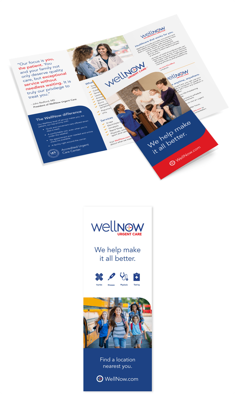
Crafting new language and style rules for WellNow’s brand began at the ground level. We started with exploring positioning statements at every size – the development and deployment of large, medium, small and micro lines would help guide the copy that appeared on each platform. All of these statements came together to celebrate the main hero for their messaging: “We help make it all better.” From there, we consciously chose matching syntax styles that would support this friendly and caring sentiment, but without the use of complicated jargon commonly found in healthcare conversations.
With these foundational lines at the helm, we moved along to choose the stylistic rules that make WellNow sound like WellNow – for every audience, tactic and promotion. WellNow’s friendly and humanistic personality traits, coupled with earned leadership qualities, informed their overall tone which we set in motion. From there, complementary decisions were made on preferred statement lengths, title capitalizations, punctuation marks, URL and address formatting, and all of the other choices that create consistency within a large and growing brand.
Even now, our team continues to refine and develop language as the WellNow brand evolves – not only in personality traits and tone, but in regional footprint and market familiarity. With messaging foundations set, we continue to build service- and neighborhood-specific statements which let patients know that WellNow really is there to help make it all better.
Creating a look that works well.
We began the branding journey with just a name and a logo – our team created a comprehensive but flexible brand platform that worked to support WellNow at the time of the brand launch, while taking into consideration planned growth and the changes that it would bring.
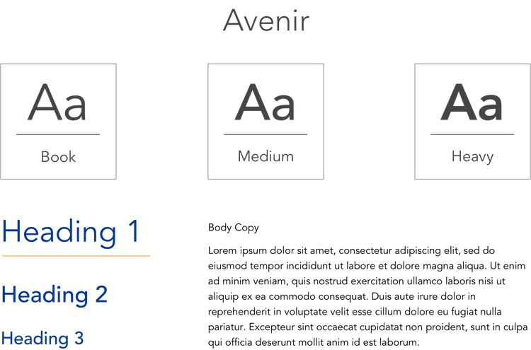
Our team chose the versatile Avenir as the primary brand typeface to convey a feeling of friendly relatability with a bit of seriousness to ensure the brand looked credible but approachable. The straight edges and fine points of Avenir help differentiate it from the logotype, while the geometric foundations make it feel aligned.
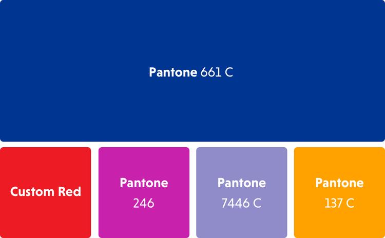
WellNow’s new brand also gave way to a bright color palette — a modern twist on a traditional medical sector color palette of basic blue and red. The addition of Pantones magenta, lavender and yellow let us create a warm and friendly visual voice that stands out and connects with key audiences.
Using these colors, we added a set of graphic elements to our brand toolkit, providing the opportunity to further integrate color and interest across tactics. The elements include soft curves and circles that reflect the lines of the logo as well as icon sets that succinctly communicate the services and benefits that WellNow offers.
The photography.
Photography is one of the most important elements of the WellNow brand. The images we select are medically accurate and also realistically representative of the experience and positive outcomes of being a patient at WellNow. The photography aims to achieve authenticity and relatability, with warm tones that subtly ground the vibrant color palette and reflect the home-like interiors of WellNow facilities. Photography is the silent workhorse that supports brand messaging, and images are often used to show viewers who WellNow is, what urgent care is and what they can expect when they visit. Our team has arranged and directed key photoshoots for the WellNow brand in addition to building out a comprehensive library of stock photography.
Custom photography
Select stock photography
Putting it all together.
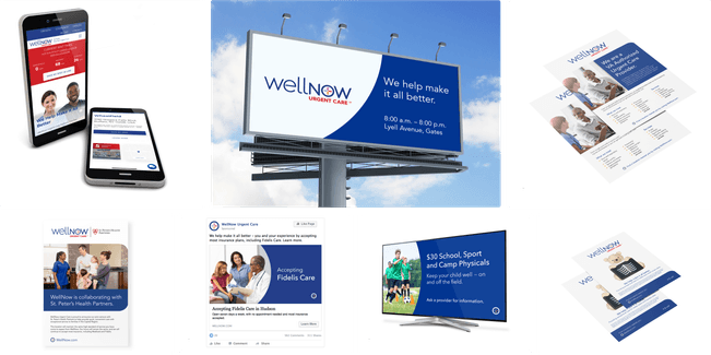
The sophisticated combination of WellNow’s brand language and design elements has led to the creation of powerful marketing strategies that further establish them as a thought leader in the urgent care industry. The work we do spans all tactics, including print media, web, digital, social media, collateral materials and community affairs.
A healthy brand in evolution.
Like all successful brands, WellNow maintains the right to evolve over time. We have continued to refine language, design and marketing strategies as we develop new and unique ways to showcase their brand and mission, keeping a steadfast focus on consistently doing what’s right for them and their growing network of patients.
The 19 Ideas team could not be more excited for the continued growth of WellNow and our role in supporting them through their expansion across New York State, Illinois and beyond. This partnership truly does help make our work [all] better.


