Person Centered Services
Person Centered Services is a Care Coordination Organization (CCO) serving over 17,000 people with Intellectual and Developmental Disabilities (I/DD) across 18 counties in New York State. As an organization, it offers customized care coordination, working with a dedicated network of providers and resources so that the individuals they serve can meet their goals.
Unpacking priorities.
Person Centered Services launched as part of a New York State transition that shifted from a Medicaid Service Coordination (MSC) model to a Care Coordination model. The change introduced the Care Coordination Organizations / Health Homes (CCO/HH), which work with individuals with I/DD and their families to bring together service providers to develop a tailored, comprehensive care plan (a “Life Plan”) for each individual. To navigate the transition, Person Centered Services needed a new brand, website and supporting assets.
To begin, we held in-depth discussions with leadership to more thoroughly understand their work. Our team visited one of their partner agencies to get a more immersive experience through meeting staff and observing programming in action. Separately, we conducted an extensive research audit to understand Western New York agencies impacted by New York State’s initiative, and to learn more about the other emerging CCOs. Our team also facilitated a mission and vision workshop with executive leadership from Person Centered Services and partner agencies to define perceptions, challenges and opportunities.

Defining a new narrative in care coordination.
With groundwork in place, we collaborated with Person Centered Services to explore who they are, what they do and what they want. Key considerations included a diverse audience, an evolving health care landscape and unprecedented statewide change in service. We identified powerful brand attributes (such as “thoughtful, “empowering”) and feelings associated with the organization. And we focused on their commitment to individual choice, holistic care and a lifetime of opportunity.
Collectively, this helped to define their mission: connecting people to the care, support and opportunities that maximize their quality of life.
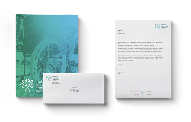
This information was the bedrock for the new logo and tagline, “Reach Your Potential.” The new logo represents the growth and aspirations of an individual reaching for a better quality of life. Traditional to the health care industry, we used an optimistic green and blue palette to highlight the warm, welcoming sentiment of the organization as a whole.
Creating connections.
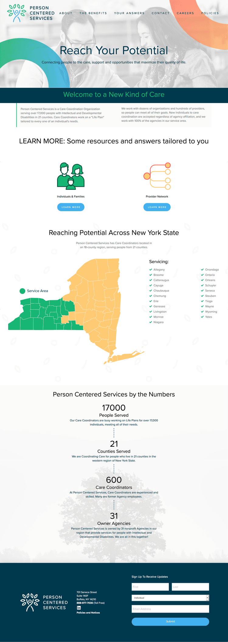
The new brand inspired the framework of the new website, which was intentionally constructed to evoke feelings of approachability, thoughtfulness and empowerment. The site presented an opportunity to show Person Centered Services’ complete vision using graphic treatments, color, photos and new messaging. The homepage graphic is brought to life using shapes reminiscent of the logo, with warm, secondary brand colors chosen to complement the primary blues and greens.
Designed intentionally as an educational resource for the transition, the website threaded these key brand elements throughout, with each page serving as a resource to learn more about the organization and its statewide transition. Features such as About, Benefits and Your Answers intentionally flowed together to encourage a seamless user experience. Our Development Team also integrated forms for users to stay connected with the organization – offering opportunities for general inquiries, newsletter sign-up and forum registration.
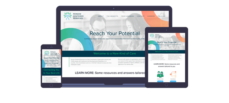
Creating robust content was important to make Person Centered Services an accessible, familiar and trusted authority for individuals and families, agency partners, and a provider network.
Business cards boldly represented the new logo, while conveying sophisticated, clear communication throughout the layout. Elements that marry with the shapes of the mark are included on the informational side of the card to create a visual interest with a wallpaper-like treatment. Branded templates for letterhead, PowerPoint and email signatures were also created to allow consistent versatility in future communication.
Functional swag including pens and Chromebook covers (for MSCs and staff) were designed, as were tablecloths and tabletop stands which provided visibility for public forums.
For broader reach, a comprehensive overview brochure and tool kit – also made available through the website – provided the opportunity to connect with Person Centered Services through a range of mediums. For those unable to access online content, printed materials and postcards provided an alternate way to stay connected.
A resolute path forward.
The logos, colors and content combine to represent a new organization committed to connecting individuals to their best lives. The entire visual story tells one of opportunity for developmentally disabled individuals with a fresh face that lets the community know that Person Centered Services is here to create personalized, positive change in an ever-transitioning industry. Whether online or in-print, remote or in-person, Person Centered Services delivered a powerful brand story, visual identity and set of collateral that instilled trust, collaboration and relationship-building with its partners and those it serves across 18 counties in New York State.
